Plants of the World Online – Royal Botanic Gardens, Kew
- Role
- Information architecture & design
- Type
- Botanical resource
- Website
- powo.science.kew.org
Overview
Plants of the World Online (POWO) is one of the world’s largest botanical resources. Kew wanted to consolidate three separate services into a single platform. I led the research and redesign, using card sorting and ranking exercises to shape a new information architecture for the plant pages.
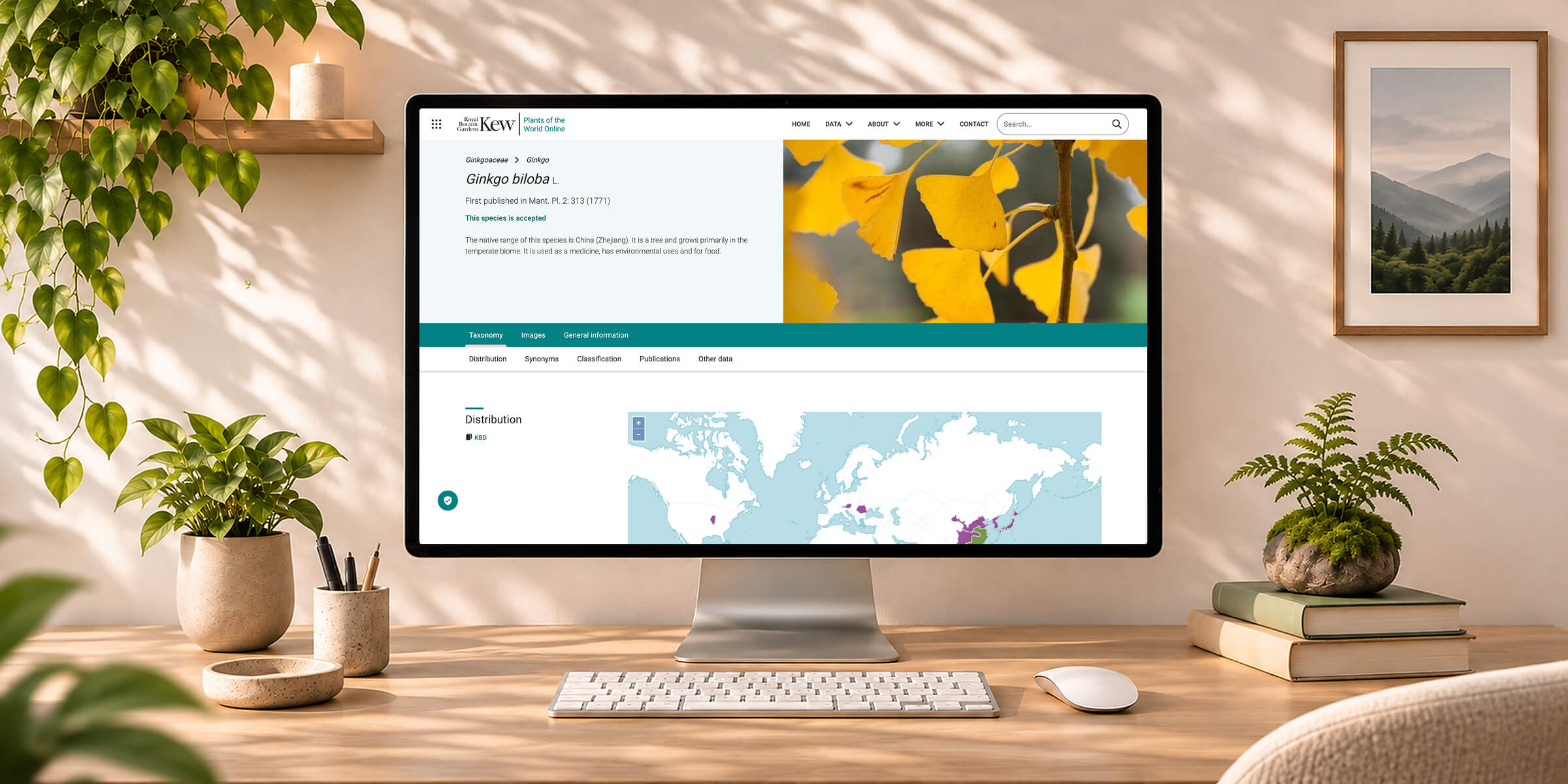
The problem
Redesigning one of the world’s largest botanical resources
Plants of the World Online (POWO) is a major botanical resource from the Royal Botanic Gardens, Kew, providing information on plant taxonomy, scientific publications, geographical distribution, imagery, descriptions and much more.
Kew wanted to consolidate three services into a single resource. Two legacy services, the World Checklist of Vascular Plants (WCVP) and the World Checklist of Selected Plant Families (WCSP), provided specialist taxonomic information but relied on outdated infrastructure. The team decided that POWO was the natural home for this information, offering a more modern platform with an established worldwide audience.
I led the user research and information architecture, then redesigned the experience to make this wealth of information more accessible to both scientific and general users.
My approach
Research-led design for complex information
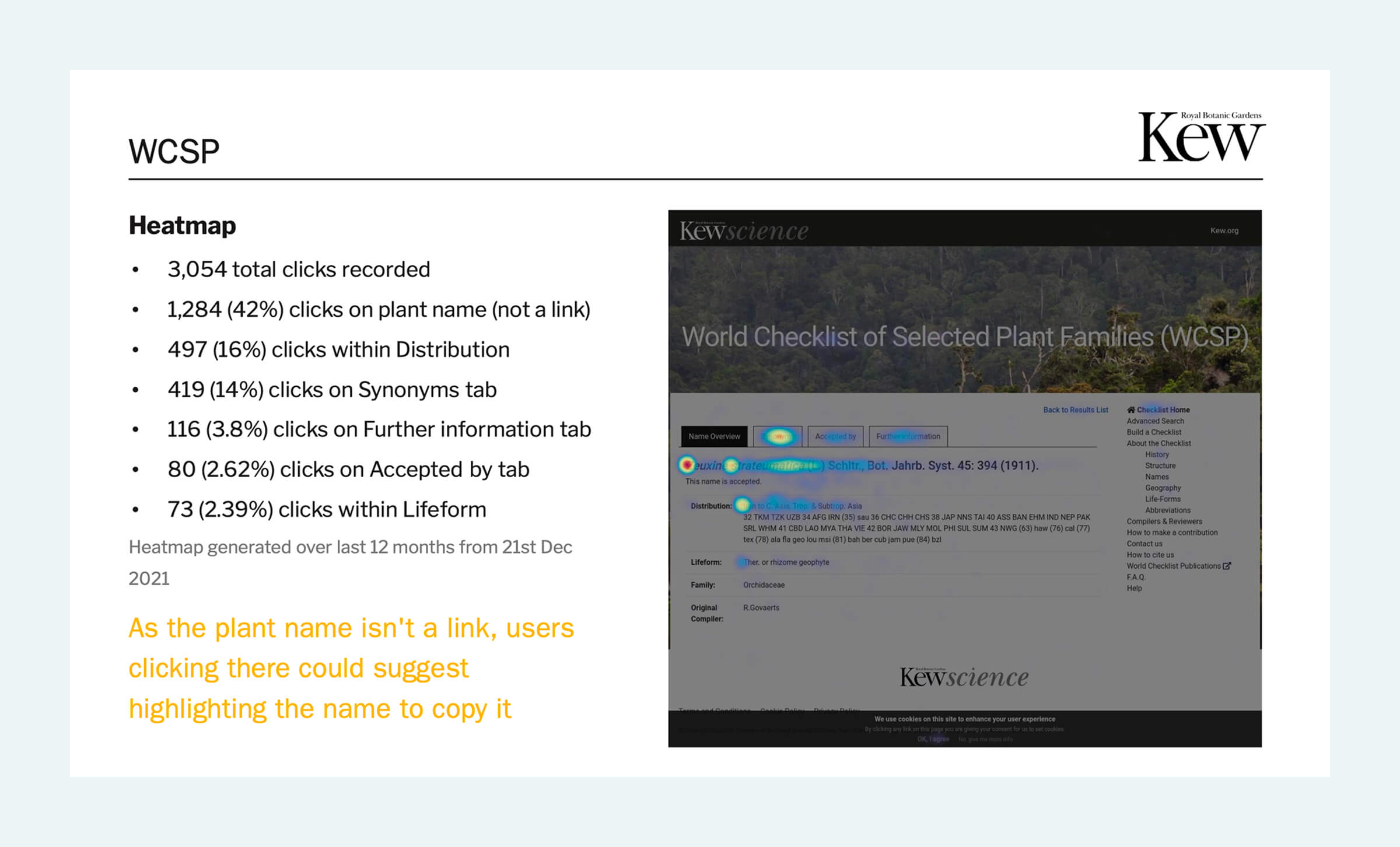
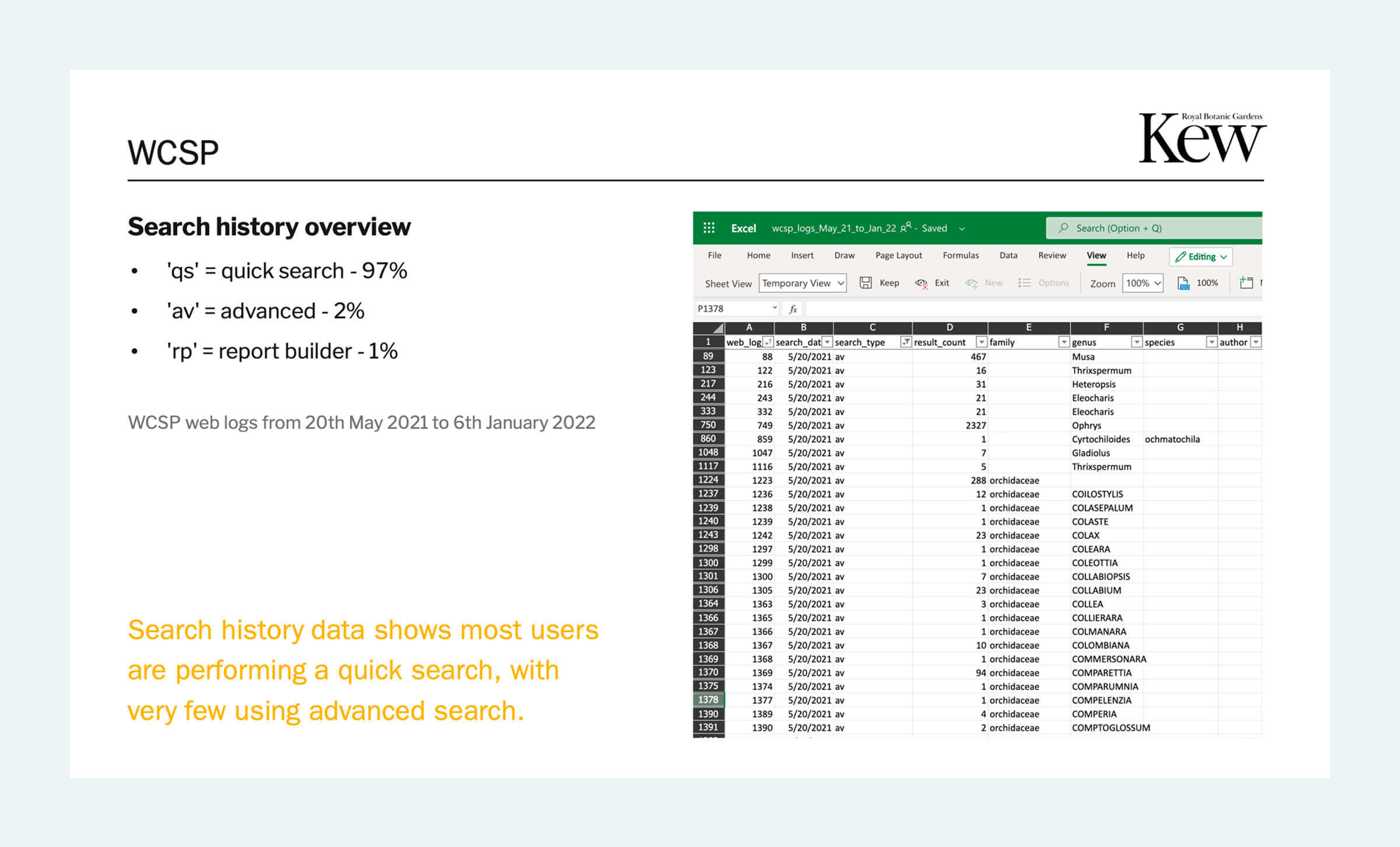
I began by using the existing data, such as heatmaps, analytics, and search logs to understand how people used the existing services. This data helped me define where to focus the rest of my research.
I used user surveys and interviews with Kew scientists, as well as card sorting and ranking exercises to uncover how users feel about the services and their needs and priorities. Analysing the research allowed me to identify patterns in how users grouped and ranked information, which helped shape the information architecture and design of the interface.
Working closely with Kew’s science and development teams, I refined the experience to balance scientific depth with accessibility, before taking the redesigned product through to launch.
01
User research & data
Understanding the three services, their audiences and user needs
02
Information architecture
Grouping and prioritising content through a card sorting exercise
03
Research analysis & insights
Analysing results through cluster visualisations and similarity matrices
04
UI design & prototyping
Designing a clearer, responsive experience
05
Iteration & delivery
Collaborating with scientists and developers to see the product through to launch
Survey results
One resource, two very different audiences
POWO serves everyone from botanical researchers looking for precise taxonomic information to general users exploring the world of plants. First I wanted to understand how many of each type of user were using the service, and whether they were getting what they needed.
To understand this, I placed questionnaires on the existing websites, asking users about their background, how they used the services and how they felt about the experience.
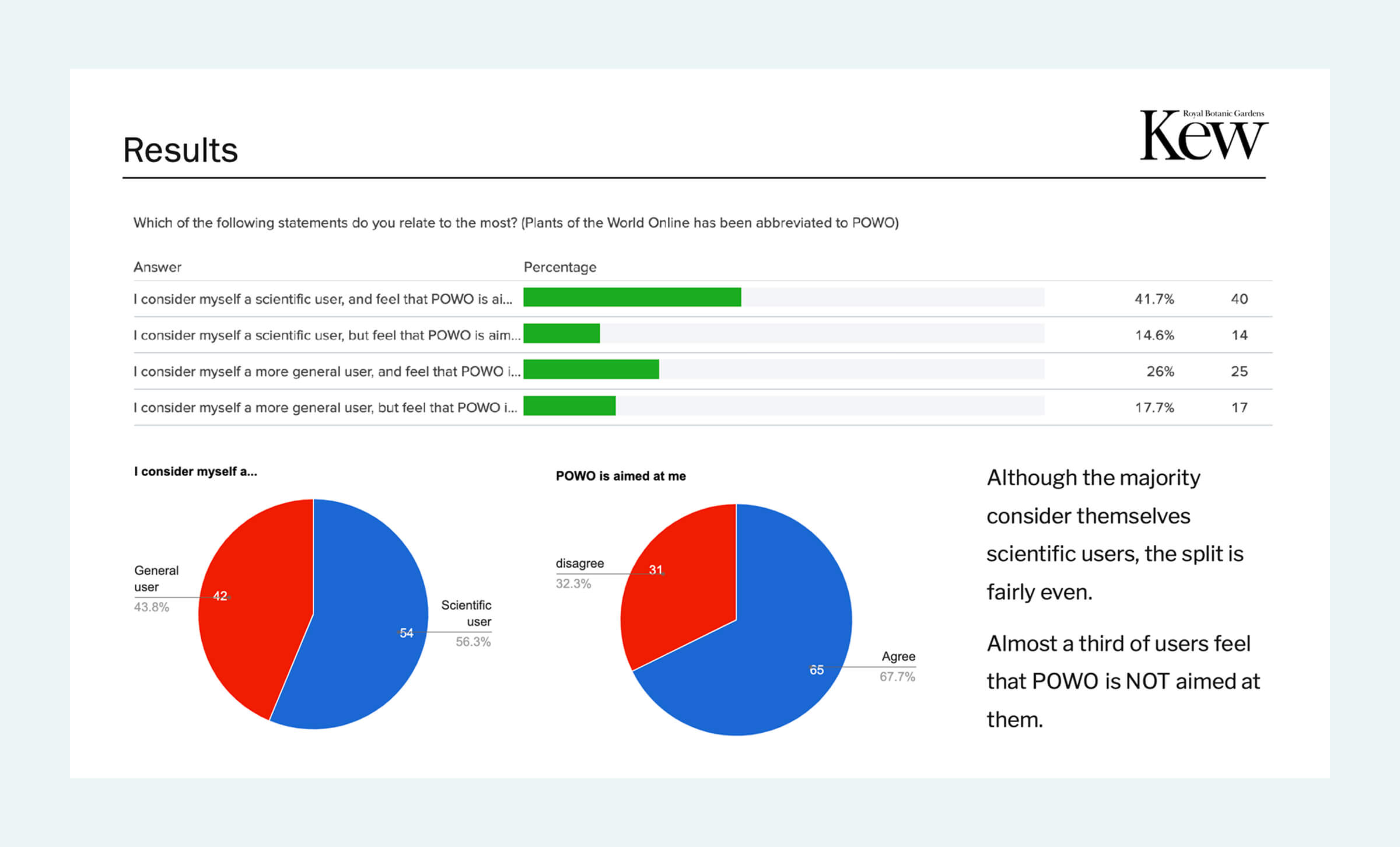
The results revealed an interesting divide. Although POWO was fairly evenly split between scientific and non-scientific users, almost a third of all users felt POWO was not aimed at them.
56%
of surveyed POWO users considered themselves to be a scientific user, whilst 44% considered themselves a more general user
32%
of all users felt that POWO was not aimed at them
44
Overall net promoter score across all users
Survey results
Confidence in the data was high, but sometimes hard to find
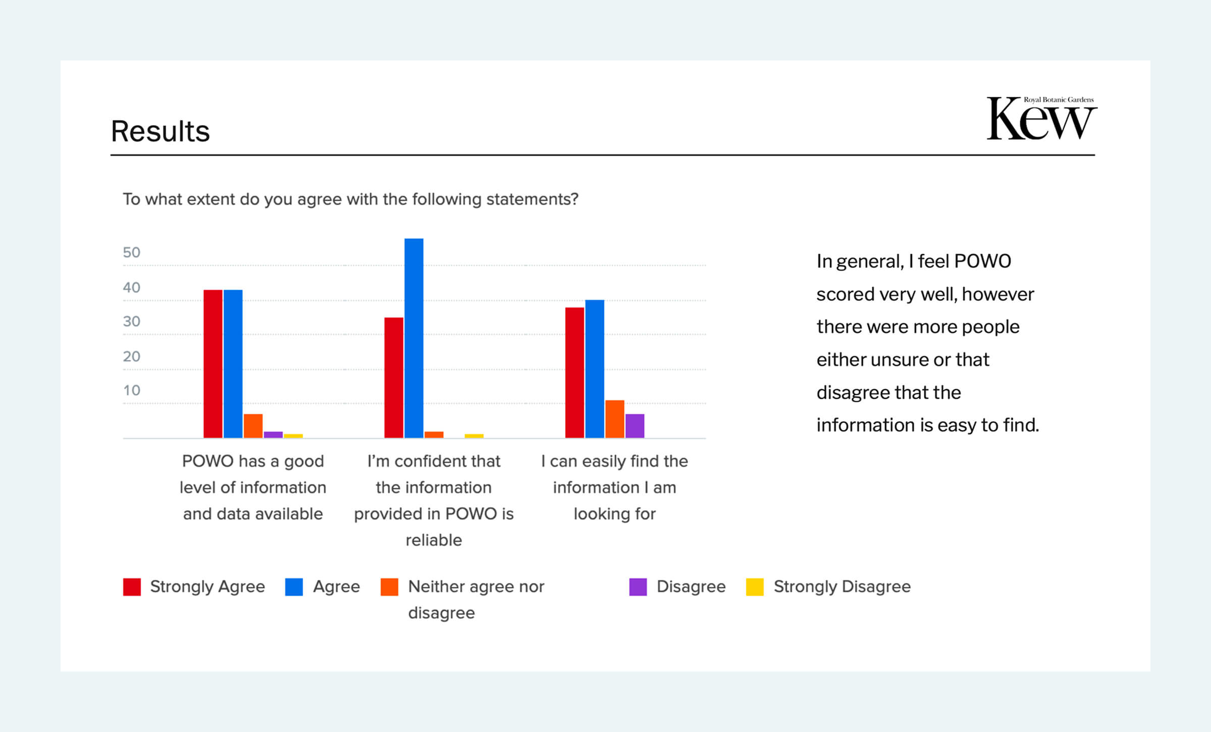
The survey also highlighted a usability issue. Users generally felt POWO offered a good level of information and data, and confidence in the reliability of that information was high. However opinions were less positive about how easily users could find what they were looking for.
These findings shaped the central design challenge: how could POWO make its wealth of scientific information easier to navigate, while creating an experience that felt relevant to both specialist and general users?
Content architecture
Finding a structure within the complexity
Although POWO already contained some of the data available in WCVP/WCSP. Not all of it was available, meaning some of the data from the other sources had to be migrated and incorporated into POWO.
With a large volume of interconnected information to organise, I needed to understand how users naturally grouped the content and what mattered most to them.
Discovering how users organise information
I chose a card sorting exercise as a way to understand how different types of users grouped the information. I conducted the activity with more than 150 external participants and over 30 internal participants, including Kew scientists who regularly used the application.
Participants grouped individual pieces of plant information according to how they felt they belonged together, then assigned names to their groups. I also asked them to rank the information in order of importance.
This gave me two complementary perspectives: how users mentally organised the content, and which information they prioritised.
Identifying meaningful patterns
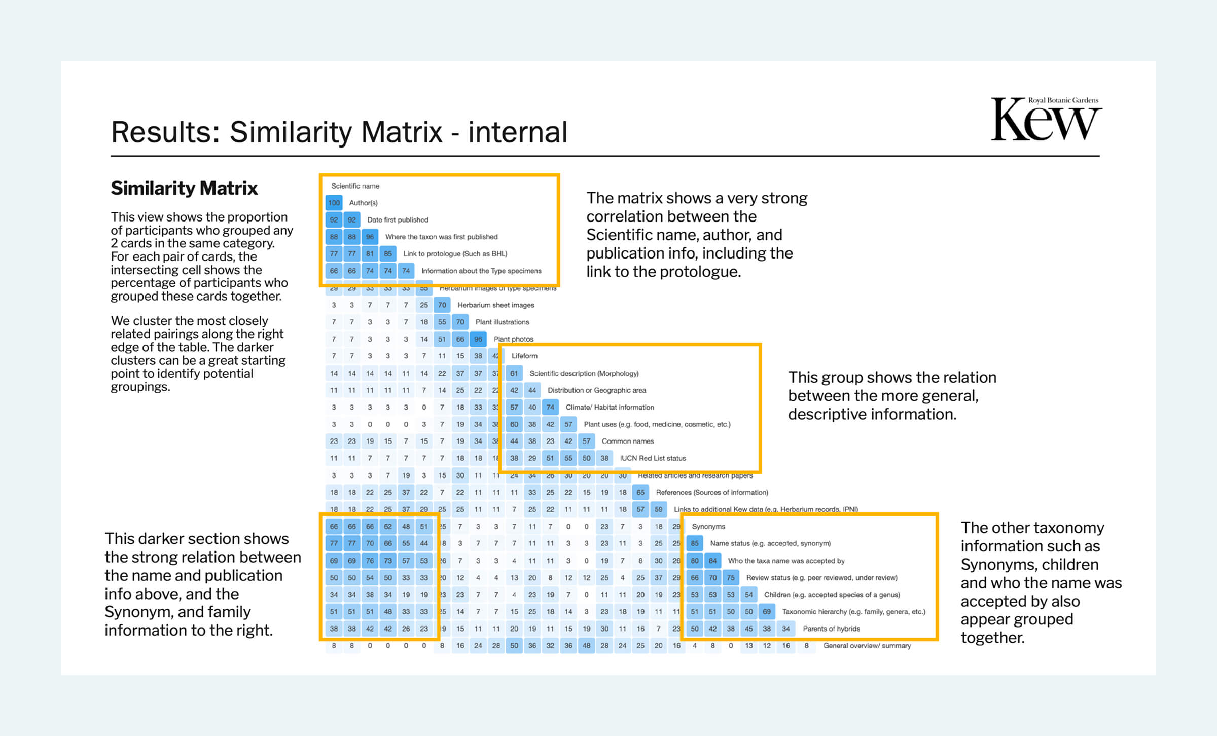
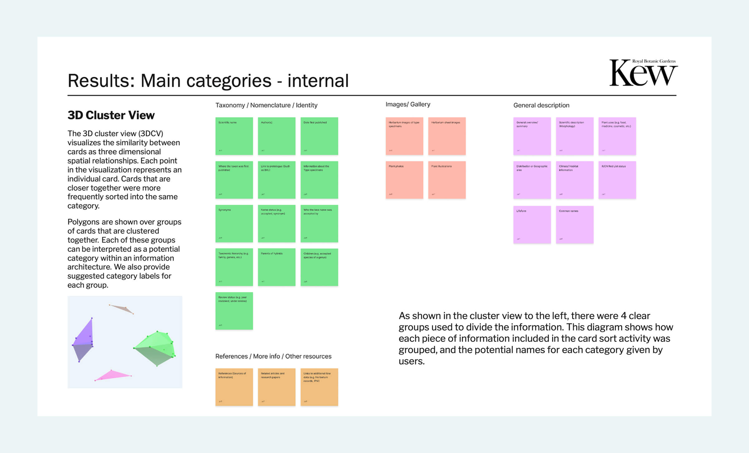
To interpret the results, I created a 3D cluster visualisation and a similarity matrix. These helped identify which information types participants consistently grouped together, revealing four clear categories:
- Taxonomy / nomenclature: Scientific names, synonyms, publication details and taxonomic relationships.
- Images / gallery: Plant photographs, illustrations and herbarium imagery.
- General description: Morphology, geographical distribution, habitat, common names and plant uses.
- References / other resources: Research papers, source references and links to additional Kew data.
The analysis provided an evidence-based foundation for the information architecture, rather than relying on assumptions about how a scientific resource should be structured.
Understanding the difference in priorities
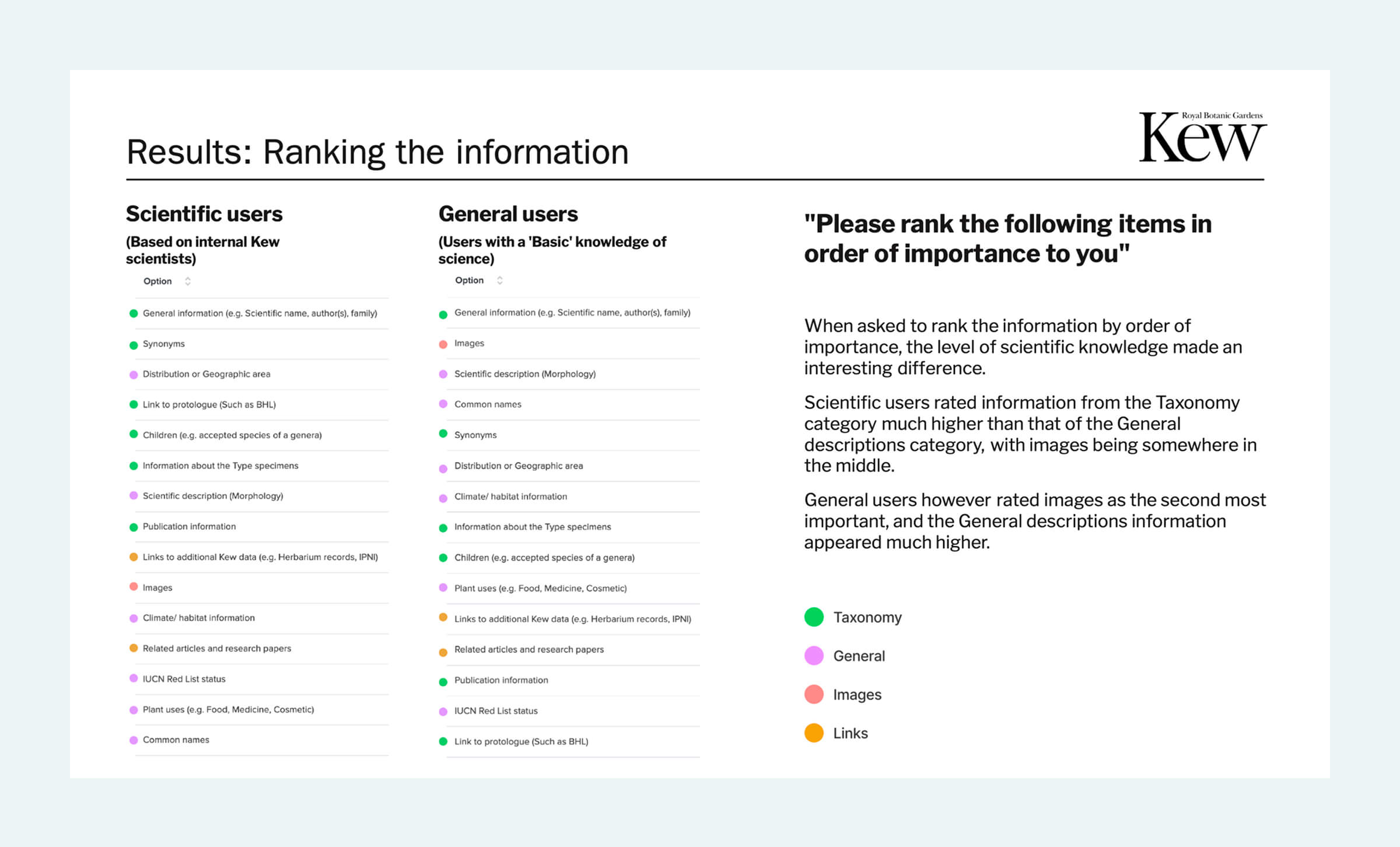
By conducting the research with both scientific and more general users, and keeping their results separate, it allowed me to compare how each type of user views the information.
The ranking exercise revealed an important distinction between the two audiences.
Scientific users placed greater importance on taxonomy, nomenclature and publication-related information. General users prioritised imagery and descriptive content more highly.
This reinforced the central challenge: presenting a huge amount of information in a way that allowed both audiences to find what they needed without forcing them through an experience designed primarily for someone else.
The solution
An information architecture built around user needs
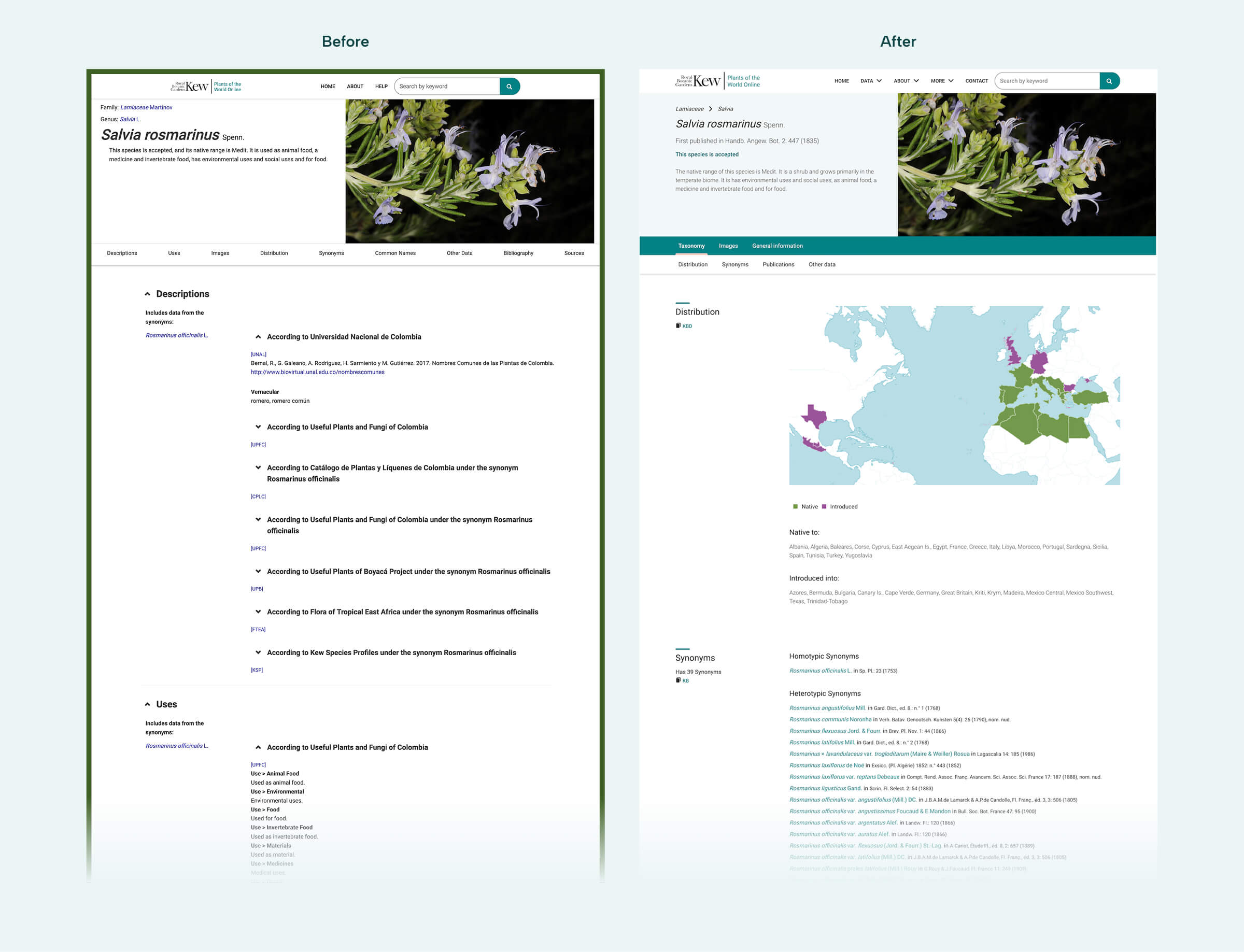
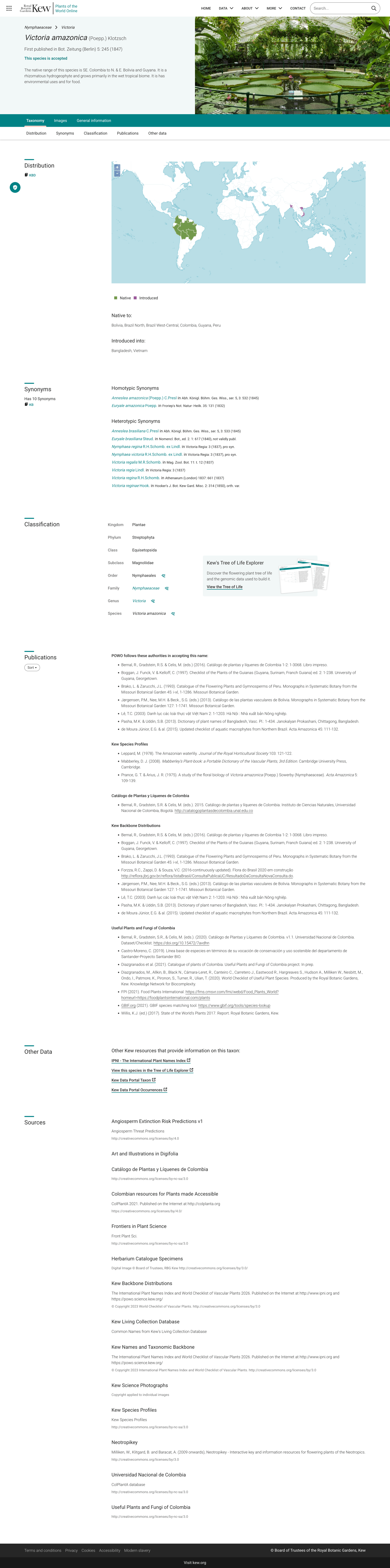
The research informed both the overall page structure and the hierarchy of individual pieces of information, as well as a number of smaller improvements throughout the site. The project was also an opportunity to modernise POWO’s overall experience. I redesigned the interface to give the website a more contemporary feel, aligning it with Kew’s brand whilst still feeling familiar to the substantial existing user base. This brought a clearer, more considered visual presentation to a complex scientific resource.
Grouping information into focused views
When considering how to present so much information on the page, I explored a sticky side navigation as one possible approach. However, keeping everything on a single page would have created a lengthy experience in which users needed to navigate up and down to find relevant sections.
Instead, I introduced three primary tabs: Taxonomy, Images and General info. This approach was a direct result from my research, as it grouped related information into focused views, allowing each type of user to quickly access the content they considered most valuable. It also reduced the amount of content presented at once, preventing less scientific users being overwhelmed by the amount of scientific information available. The Taxonomy tab was visible by default, reflecting the slight majority of scientific users and ensuring that specialist information remained at the forefront of the service.
This also meant that I could use the space at the left for a sticky section header. As some of the sections can be quite long and data heavy, separating the header from the content makes each section much clearer, and having the header always visible prevents the user from losing track of where they are.
Creating a hierarchy within each view
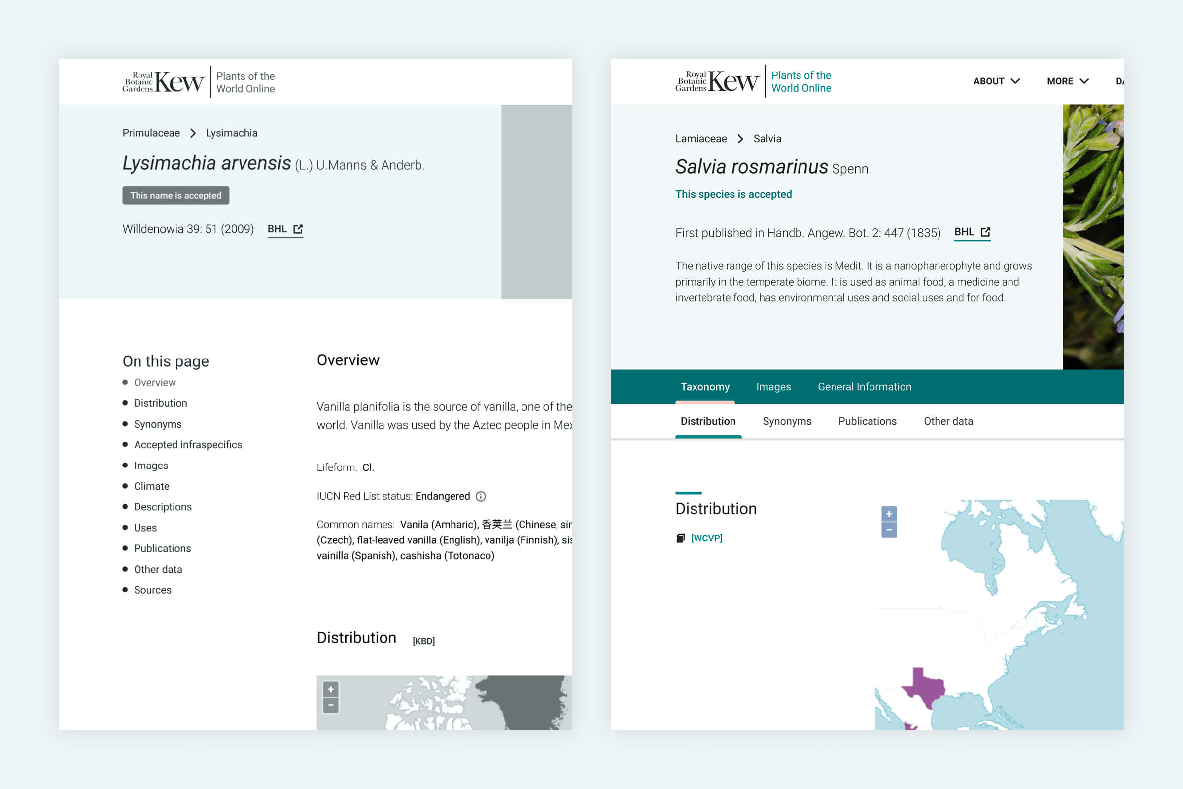
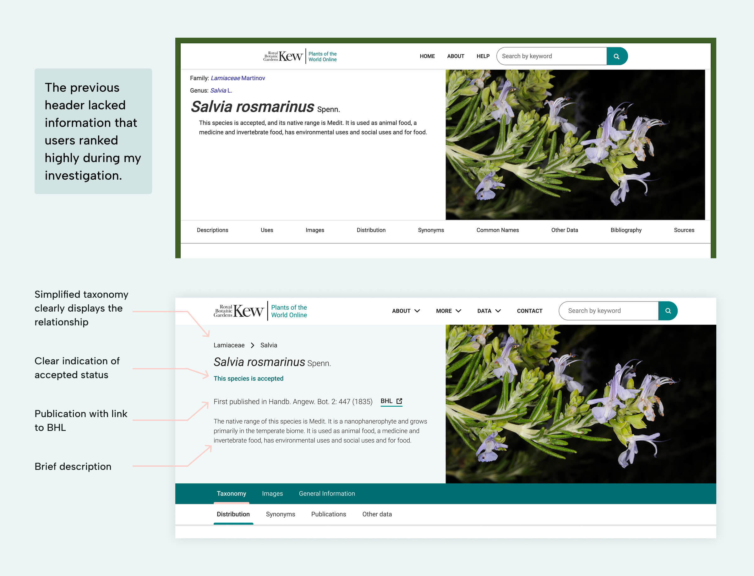
The research also influenced how information was prioritised within the page itself. I used the ranking results to determine which details should appear in the header, including the scientific name, taxonomy, publication information and accepted status. This allowed users to access important identifying information immediately, while keeping the more extensive supporting content organised below.
I also introduced a secondary level of tabs to help users jump directly to relevant sections within the main view. This divide of information made it easy for the user to get directly to the information they needed, whilst preventing a long list of tabs as before. The visual distinction between the two levels made it clear that the secondary navigation belonged to the selected primary tab.
Together, these decisions created a layered information architecture: important information was easy to access, related content stayed together, and users could navigate directly to the level of detail they needed.
Improved search and discoverability
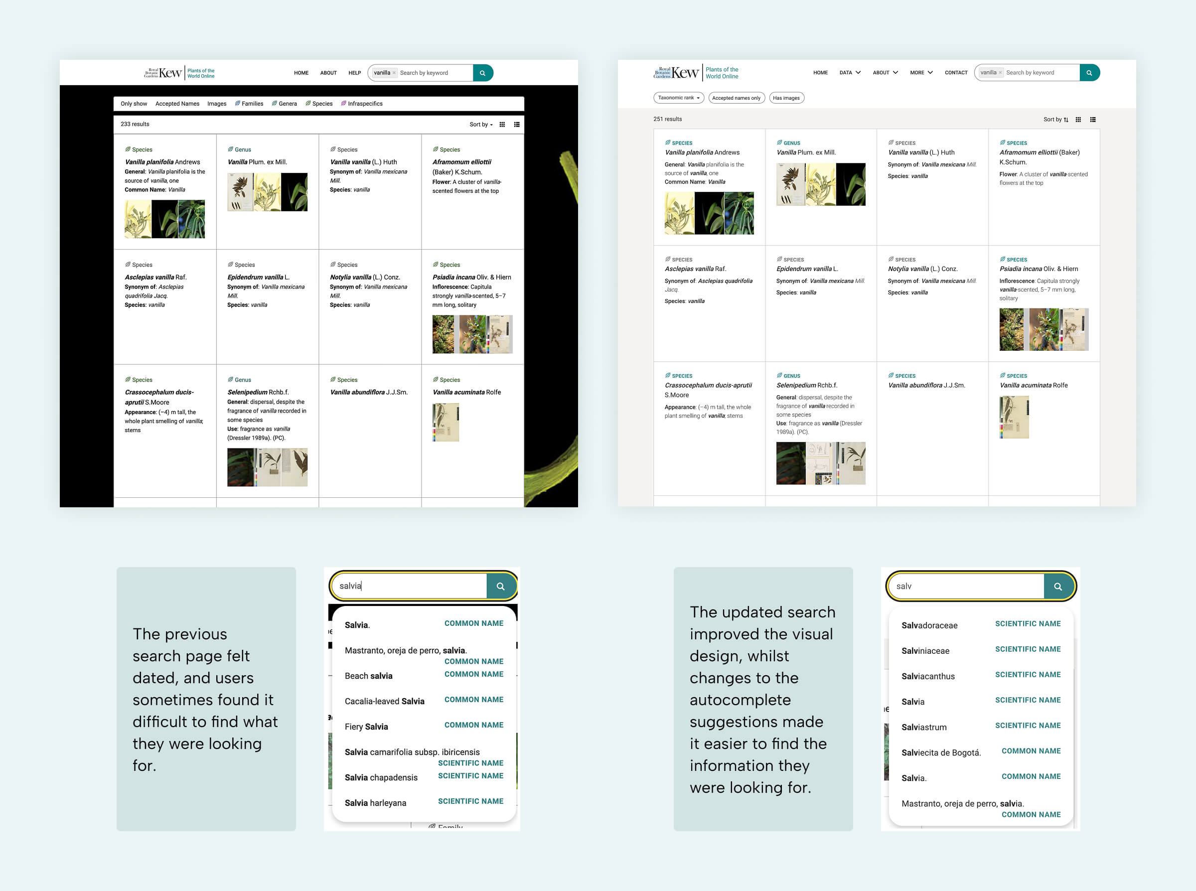
Questionnaire responses indicated that users did not always find the information they were looking for easily. I therefore improved the search experience as part of the wider redesign, addressing discoverability alongside the information architecture.
My solution included an update to the visual design of the page, as well as improving the relevancy of the auto-suggestions, to ensure it was suggesting the type of content people were searching for. I used the data from the search logs, as well as questionnaires focussed specifically around search, to analyse what people were searching for. In the previous application, the autocomplete suggested characteristics that a user could search for (e.g. yellow flowers) however this created a cluttered experience, and research showed that users were not conducting that type of search.
For that reason we decided to remove the characteristic suggestion, and focus on suggesting the taxa in an order that made it much easier for the user to find what they were looking for.
The outcome
A clearer way to explore the world’s plants
The project established a research-led approach to consolidating Kew’s botanical resources within POWO, with the redesign addressing both the complexity of the information and the different needs of its audiences. The resulting experience introduced a clearer structure for navigating botanical information, prioritised content according to user needs, and modernised the interface while retaining access to specialist scientific data.
Unfortunately I wasn’t involved post-launch to compare how the changes made a difference to POWO. Had I had the time, I would have repeated my initial survey and compare whether the implemented changes affected the user opinion of the website.
Recognition
I was asked to present the upcoming changes to the entire Science team at Kew Gardens (including over 100 scientists and staff members) and received very positive feedback.